These days, thanks to Chantal and Nicolas, I made many usability improvements to AlternC, the web control panel software suite, the free software project I started long ago…
During my development phase, I created a nice style to show « forced text fields » in web forms. Those text input fields used when part of the field content is locked.
How does it work and how does it looks like ?…
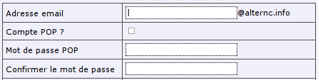
Ugly usual text fields
When surfing the web, we often fill forms, text areas, check boxes etc. This is even our main usage of the Web : when you search something using a search engine, or when you send an email using a webmail, you are filling forms and fields …
Sometimes, you only have to put the beginning or the end of the form field value
e.g.: I want to create an email address on my domain name. I have to enter the email address, but the domaine part should be fixed and forced.
Historically, when doing this using AlternC, you find this form : a text area followed by @yourdomain.net, showing the right side already filled.
Graphically, it looks like a classical form field as follow :
A hype text field
Some days ago, trying to find a usable way of showing this, I had the following idea (I say I had this idea since I never saw this elsewhere) : we can use CSS styles to show something more obvious for human being. So I ended up with this:
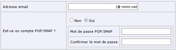
There is many differences between those 2 forms, but the one we are interested in is the field where you can enter your email address.
In the second case, we understand that we will fill a text field that will be an email address. The cursor is align to the right, and right before the domain name and @ sign.
The HTML are using a CSS style so that we cannot see any difference between both of them. And there is no javascript tricks that will prevent the user to change the domain name : it’s not even inside the text field !
This idea is simple, and I invite my fellow developers to use this kind of trick without any limitation : as long as it make a form more usable for your end user (ask him if you have any doubt 😉 ).
Technically, it’s simple:
HTML-side :
@mondomaine.net
CSS-side :
.int

	border: 1px dotted black;

	background-color: white;

	font-family: Verdana, Arial, Helvetica, sans-serif;

	font-size: 11px;

	padding: 2px;

	color: black;


#adrlbl

  border-left: none;

  padding-left: 0px;

  text-align: right;


#adrtxt

  border-right: none;

  padding-right: 0px;
Finally, more tricks & tips I just remember :
– list the words and terms you are using for each part of your software. For example, we are using « email address », and not « email », « mail », or « mail account ». Build a glossary your developers will have to follow.
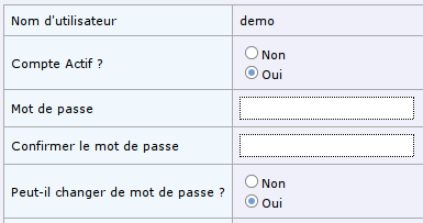
– use radio button instead of dropdown lists if you want, unless the number of items may grow large (an example is shown below) :
before :
after :
– Leave some space inside your forms : the human eye need some kind of freedom to see things. For example, in the 2 forms below, you will see that there is more space between elements in the second form, but the border is also less visible, we are using a light gray: the eye can freely navigate inside this form.
And finally, if I remember other ideas regarding website or forms usability, I will post them here 😉